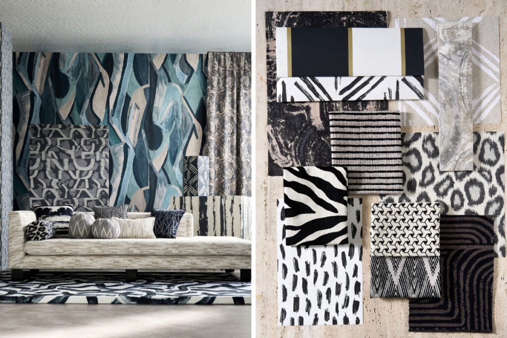
If your place feels a little too safe—like everything’s beige, polite, and predictable—Clarke & Clarke’s Metropolitan Collection is the kind of fabric range that can flip the mood fast. This collection is built around the rhythm of an urban landscape: bold geometry, abstract movement, and a palette that leans into noir tones (think ink, slate, black-and-white) with lighter neutrals to balance it out.
And yeah, it’s “luxury,” but not in the gold-trim-everything way. It’s more like modern luxury—textures that look expensive, patterns that feel curated, and designs that hold up when you actually use them on real furniture.
What the Metropolitan Collection is all about
Clarke & Clarke describes Metropolitan as texturally expressive and visually dynamic, playing with the energy and structure of the city.
That shows up in two main ways:
-
Graphic pattern language: geometric, abstract, and art-inspired motifs (you’ll see plenty of structured shapes and painterly movement depending on the design).
-
Tactile, upholstery-friendly feel: a lot of these designs are positioned as fabrics you’d actually want on sofas, chairs, cushions, and heavy-use pieces—where texture matters as much as the print.
Also important: Metropolitan isn’t just fabric—there’s wallpaper too—but if you’re shopping for upholstery, the fabrics are where the collection really hits.
The vibe: noir, modern, and a little art-gallery
The easiest way to describe the vibe is: city nights + modern art + clean interiors.
A lot of the color naming you’ll find across retailers sits in that world—Noir, Ink, Slate, Linen, Ivory—so it’s moody without being heavy.
This is why Metropolitan works so well for modern luxury interiors:
-
It can look high-end even in simple spaces.
-
It plays nicely with minimal furniture silhouettes.
-
It gives you statement energy without needing loud color everywhere.
Basically, it’s the kind of upholstery that can make a plain sofa feel like a design decision.
Patterns you’ll see (and how to use them)
Different stockists list different designs, but you’ll notice recurring types of patterns inside the Metropolitan Collection:
1) Geometric and architectural repeats
These are your “structure” patterns—clean angles, layered shapes, and repeats that feel like architecture, grids, and city planning.
Where they shine: accent chairs, dining seat pads, headboards, or tailored cushions.
2) Abstract brushstroke / movement prints
These are more expressive—less “perfect repeat,” more “energy in motion.” Some retailers even reference the collection as drawing inspiration from abstract art.
Where they shine: statement cushions, a feature armchair, or a bench seat where you want visual movement.
3) Jacquards and textured weaves
Retail listings show a bunch of items tagged as jacquard (like Hatoum Jacquard, Taryn Jacquard, and others), which usually means the pattern is woven in, not just printed—often giving a richer look and better depth up close.
Where they shine: sofas, lounge chairs, ottomans—anything you touch a lot.
Why these fabrics feel “luxury” in a practical way
Modern luxury upholstery isn’t only about how it looks in a styled photo. It’s about how it behaves after six months of living.
Here’s what makes the Metropolitan Collection feel premium in a more real-world sense:
-
Texture that reads expensive: “tactile” is a word that keeps coming up around the collection.
-
A refined palette that doesn’t date quickly: noir + neutrals tend to stay relevant even when trends shift.
-
Designs that scale well: bold patterns work best when they’re designed to look good from a distance and up close—and Metropolitan’s “visually dynamic” direction points to that.
Also, because the patterns lean graphic and architectural, they often pair easily with common interior materials: oak, walnut, black metal, travertine, polished concrete, brushed stainless, and warm whites.
Best rooms to use Metropolitan upholstery fabrics
If you want the collection to look intentional (not random), start with spaces that already have some structure.
Living room
Go bold on an accent chair, or pick a textured jacquard for a main sofa and let the cushions carry the graphic pattern. Retailers position Metropolitan as a “sophisticated” mix of geometric and abstract looks, which is perfect for this mix-and-match approach.
Home office / studio corner
This is a cheat code: one strong fabric on a chair can make your workspace feel designed without redoing the whole room.
Bedroom accents
Headboard upholstery in a darker “Ink/Noir” tone can instantly make a bedroom feel more boutique-hotel, especially with warm lighting.
Hospitality or commercial
Metropolitan’s bold-but-refined style works for boutique cafés, lobbies, and lounges—places where you want impact but still need a cohesive look.
Styling tips so it doesn’t feel “too busy”
Metropolitan can be punchy, so the trick is balance:
-
Keep walls calmer if your upholstery is graphic.
-
Repeat one tone (like black, ink, or slate) in small details—lamp base, frame, side table—so the fabric doesn’t look isolated.
-
Mix textures, not patterns. If you’ve got a strong jacquard, pair it with a plain linen-look or velvet cushion rather than another loud print.
-
Use neutrals as negative space. Ivory and linen tones help the darker designs breathe.
Where to find it and what to expect when browsing
On Clarke & Clarke’s official site, the Metropolitan fabrics are shown as a collection with multiple designs and colorways.
Meanwhile, retailers like Wallpaperdirect and Jane Clayton list many of the same designs and give you an easier “shop and compare” experience, often showing price-per-metre and variants.
One practical move: shortlist 3–5 patterns you like, then pick them in two directions:
-
1 “hero” pattern (graphic/abstract)
-
1–2 textured solids or calmer weaves to support it
That way you build a mini system instead of buying one fabric that has no friends.
Final thoughts
Clarke & Clarke Metropolitan Collection upholstery fabrics are for people who like clean interiors but still want personality. The collection hits a sweet spot: urban energy, modern art influence, tactile texture, and a palette that stays classy.
If you’re trying to get that “modern luxury” look without turning your home into a showroom, Metropolitan is a strong option—especially for statement seating and cushions that can carry a space.
If you want, I can also make the focus keyphrase + Yoast green meta description + 20 tags for this topic in the same style as your previous requests.