Perla Residence by STIPFOLD: A “Frozen Wave” Villa in Marbella That Actually Feels Calm
There are a lot of coastal homes that say they’re inspired by the sea. You know the type: some blue accents, a few nautical vibes, maybe a balcony view and that’s it. Perla Residence by STIPFOLD goes in a totally different direction. Instead of decorating a house with “ocean energy,” they tried to turn a single moment of the ocean into architecture specifically, the instant a wave breaks and hangs in the air for a split second.
And honestly? It’s one of those projects where the concept sounds poetic at first, but the execution is what makes it feel real.
The Setting: Marbella Hillside, Mediterranean Light, Big Views
Perla sits on a hillside in Marbella, Spain, which already sets the tone: elevated views, strong sunlight, and that Mediterranean contrast of bright surfaces against deep shadows.
What’s interesting is that the client apparently bought an existing project that was already in the submission stage meaning STIPFOLD didn’t have full freedom to change the “bones” of the building. So instead of forcing a total reset, the studio leaned into a different kind of transformation: conceptual and sculptural, not structural.
That limitation is actually a big part of why the final result is compelling: the design feels like a very intentional overlay, a kind of architectural “carving” that reshapes the experience without needing to demolish everything first.
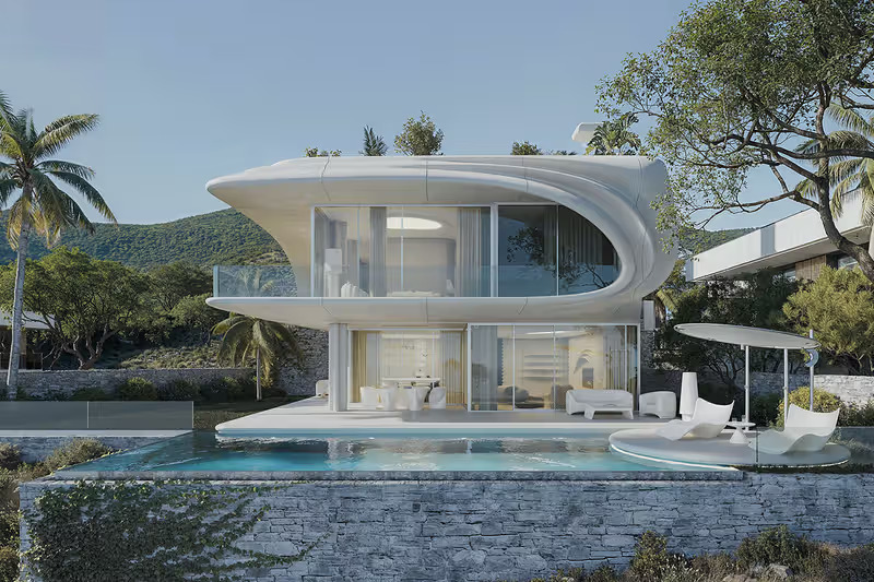
The Exterior: A White Shell That Reads Like Motion
From the outside, Perla’s identity is pretty clear: a continuous white shell with curvature and layered forms that make the house feel like it’s moving even though it’s literally concrete and stone. The project is often described as capturing a breaking wave frozen mid-air, and you can see why.
One of the standout material choices here is fiber concrete (sometimes referenced as “fiber-reinforced” concrete in project writeups). It’s doing two jobs at once:
-
It can be sculpted cleanly into those soft, flowing curves.
-
It keeps the surface looking smooth and bright, which matters a lot in that coastal sun.
Then you’ve got natural stone grounding the whole thing basically anchoring the “wave” to the hillside so it doesn’t look like a floating gimmick.
This is the part I like: the concept could’ve easily turned into a showy statement piece, but the materials keep it disciplined. White shell = lightness. Stone base = weight. That contrast makes the form feel intentional, not chaotic.
The “Frozen Moment” Idea Isn’t Just a Metaphor
A lot of projects use nature metaphors as marketing language. Perla actually pushes the metaphor into how the building reads from different angles. Descriptions mention that from below, the massing feels like a suspended ripple like you’re seeing the underside of a wave curl.
That kind of viewpoint-based design is smart because it means the architecture isn’t only “pretty from the front.” It becomes more cinematic as you move around it, which is exactly how you’d want a wave-inspired form to behave.
Interior: Quiet, Minimal, Still “Wavy” But Controlled
If the exterior is the dramatic “frozen wave,” the interior is more like the calm water after the crash.
Project notes describe beige fiber concrete walls with flowing parametric lines, basically echoing the exterior movement but in a softer, more intimate way.
Instead of going loud, STIPFOLD keeps the palette restrained:
-
whites
-
sand / beige tones
-
pale wood
-
lots of natural light
That’s not revolutionary as a palette, but it works because the shapes are already doing the talking. When you have curving ceilings, continuous lines, and sculpted surfaces, adding busy colors would just fight the architecture.
The vibe is visual silence not empty, not cold, just calm enough that the light and shadows become the “decoration.”
Flow and Rhythm: The House Moves Like a Single Gesture
One thing that comes up in descriptions is how the custom elements follow a continuous rhythm even down to the kitchen island and ceiling curves.
That matters because it’s easy to design a curvy exterior and then give up inside (straight drywall, standard ceiling, done). Perla seems to treat the interior as part of the same sculptural idea, so you get continuity instead of a “wow outside, normal inside” situation.
In other words: the wave doesn’t stop at the front door.
Why It Feels “Luxury” Without Screaming Luxury
A lot of modern luxury villas lean on obvious signals: glossy finishes, heavy marble, dramatic chandeliers, extra-everything. Perla feels more like luxury through control:
-
The form is bold, but not messy.
-
The palette is minimal, but not sterile.
-
The materials are tactile, but not over-polished.
And because the design is tied to the landscape (Mediterranean context, sun, sea movement as concept), it doesn’t feel like an imported style pasted onto Marbella. It feels site-aware, even if it’s still very sculptural.
The Bigger Point: Sculptural Minimalism With Emotion
One line that sticks out from the project writeups is the idea that this isn’t meant to be neutral it’s meant to make you feel something, while still keeping function “pure.”
That’s kind of the sweet spot for STIPFOLD’s approach here: they’re not doing minimalism as “blank white box.” They’re doing minimalism as precision + emotion. The house doesn’t need ornament, because the geometry is the ornament.
And if you zoom out, that’s why the wave concept works: waves are literally geometry in motion. Turning that into architecture is risky, but when it’s executed with restraint, it becomes memorable.
Final Take
Perla Residence is one of those projects where the headline concept a wave frozen in time could’ve easily become a one-liner for press coverage. But the real win is how consistently the idea is carried through: exterior shell, grounded stone, interior rhythm, calm palette, and light doing half the storytelling.
If you’re into architecture that feels sculptural but still livable, Perla is worth studying. It’s not trying to be everyone’s taste. It’s trying to be a specific feeling: motion turned into stillness like the sea holding its breath.